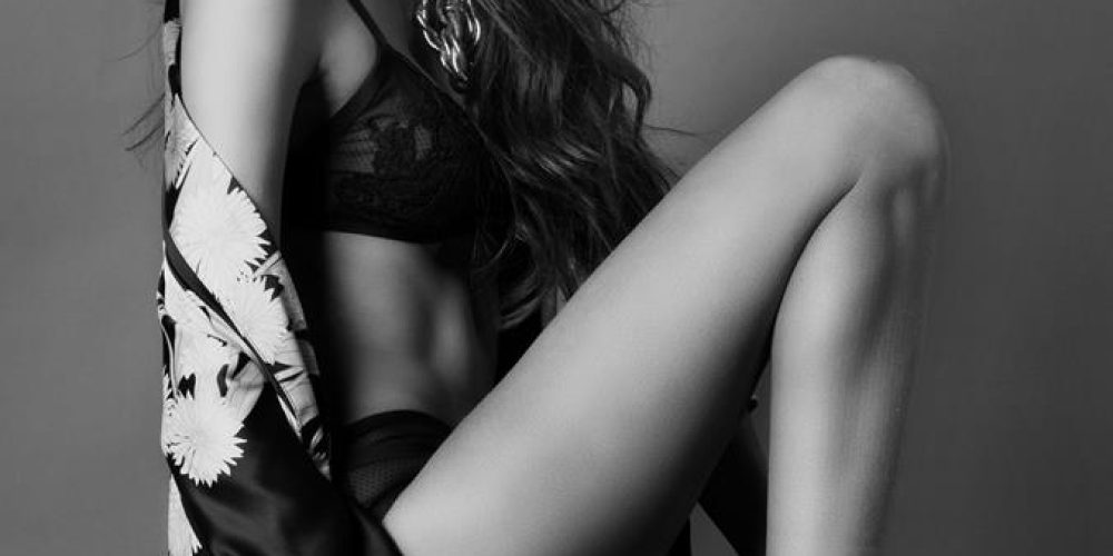
Countless articles and even books have been written on what a portfolio should contain. The truth is, there is no single answer. It depends on what the portfolio is trying to achieve, where it will be used, what kind of work, clients or agency the portfolio is intended to influence and what the model’s characteristics are.
The only advice for any kind of model is this: only the very best pictures go into your book. It is far better to have four outstanding pictures than 20 mediocre ones. The rule is this: You are only as good as your worst picture. When possible, inclusion of good tearsheets is very important to a fashion model. Even so, not all tearsheets are good; small pictures from 1/8th page ads from minor advertisers
don’t belong in your book or card. A portfolio should include at least one “head shot” or “beauty shot”, and one ¾ or full length shot to show of the general lines of the body.
Fashion Models
Fashion models who want to try self-marketing (which, in a large market, is very difficult) need a book of the same kinds of pictures that would be in an agency model’s book. These can be found on composite card samples at print shops that specialize in comp printing, on line at agency web sites, and in looking through
editorial fashion magazines.
Commercial Print Models
It never hurts to treat both casting directors and agents as Bears of Very Little Brain when applying to them. Don’t make them think too hard to see you as what they need. If they have to say to themselves, «Gee, with a different haircut, more atural makeup and wearing a business suit maybe she could work» as likely as not you won’t get selected. If you are to present a «developed, ready to work» impression to a commercial print agency or client, you need to either learn to
be VERY objective in evaluating yourself (do I look like a «mother», or am I too glamorous?), and perhaps in restyling yourself to meet what commercial print wants (typically: conservative, mainstream looks unless you are some special type).
Look at non-fashion print ads until you can honestly, objectively tell yourself «I could have been in that ad,» and then put a shot of yourself playing that role on your comp. Do that several times, for several roles, and you have what you need.
Each agency will have its own style of picture, and it’s helpful to look at some cards of people the agency represents before you have your own done. But here are some general guidelines that should apply to most commercial print or small
market agencies:
1. The pictures need to be in color. Clients care about coloration; you need to show it to them. Still, if you have an excellent B&W shot there is no reason not to include it.
2. Get a great headshot (beauty shot). Not a good one, an absolutely great one. That is the single most important shot in getting you accepted or hired, and it isn’t unreasonable to spend half your time and resources on it. It should be in
color, clear, evenly lit, with a friendly, accessible expression on your face, ideally a smile. If you have good teeth, it’s preferable (but not mandatory) to show them.
3. Backgrounds, props and poses need to be chosen to lend a sense of believability to the shot. There is nothing wrong with a picture or two taken against a seamless sheet of paper, but some of the pictures (ideally most of them) should look more like location settings — even if done in the studio. Never, ever shoot with a photographer who wants to use a cloth background. Muslin or sheets, painted or not,
look cheesy and are very rarely seen in a commercial book or comp.
4. If you are a woman, pay for a good, print-qualified makeup artist, ideally one who also is proficient with hair. Unless you are a graduate of cosmetology school with a specialization in makeup, don’t do your own. Even then it is a bad idea. If the photographer doesn’t provide a makeup artist, don’t shoot — simple and important as that. For men it’s less clear-cut, but you will probably need to use powder for shoots.
5. The most common mistake: The first picture is of you wearing an outfit. The second picture is you wearing the same outfit in the same setting, but posed differently. The third picture is of you in the same outfit in a slightly different location, posed differently. The fourth picture . . . (well, you get the point). The second most common mistake: The first picture is of you wearing an outfit. The
second picture is you wearing a different outfit in the same setting, but posed differently. The third picture is of you in another outfit in a slightly different location, posed differently. The fourth picture . . . (again, you get the point). Or maybe you don’t get the point. Your pictures should show you looking like pretty much anything BUT a model, so get shots that show you doing something other
than being a model. «Fashion» is about models, commercial print isn’t. Commercial «models» are hired to represent «real people only better», and if your entire book or card is you looking like a model, you have failed. The purpose of the pictures should be to show a role being played by you, not you displaying «another look». The first impression a viewer should have is that it is of a business woman,
firefighter, young mom, soccer player (or whatever role you are playing in the shot). Only secondarily should they notice that it is a “picture of you.”
6. Get pictures that look like the kind of work you want to do. If you aren’t a fashion model, don’t get «fashiony» pictures. Wild makeup, strange angles, weird lighting . . . all that stuff is pretty and fun to do, but useless in a commercial
print book.
7. Get pictures that show what you have to sell. If you have great legs, make sure at least one picture shows them effectively. If it’s your eyes, the same. Unless you have bad teeth, show them in at least one picture.
8. One of the most effective shots that can be in a commercial model’s book or card is an “interaction” shot. That’s a picture that shows you with a mother, husband, child, coworker or even an animal or an inanimate object to interact with: a computer screen, for instance. What the shot must show is your ability to portray the emotions that go with that person or thing – your acting ability. The worst kind of “interaction” shot is one that shows two people simply mugging for the camera. Cheesy glamour (which means glamour pictures shot by almost anyone but a commercial photographer) is not acceptable. For models at the glamour end of the commercial market an excellent glamour shot with good production values can be an
asset to a card.
Glamour Models
Mainstream glamour models should have a composite card specifically for that purpose, and a separate card for non-glamour jobs. Some commercial clients will be put off by “glamour” pictures on a model’s card; conversely, most commercial printstyle shots don’t portray a model as glamorously as she should be for glamour jobs.
Specialty Models
A specialty or “parts” model needs a card that shows closeup shots of his hands, feet or whatever he or he specializes in. The shots need to be elegant and stylized, letting clients see the shape of the parts. Most parts cards also have a small head shot of the model for reference, in case the client wants a shot that features the parts, but also shows more of the model.
Children
Child performers or models have less demanding requirements for pictures. Casting directors understand that children change rapidly as they grow up, and do not equire full comp cards or portfolios. A professional headshot (8”x10” or even 5”x7”), reproduced in quantity, should be enough for most purposes. Some local agencies even advise using snapshots only for young children, although that is usually not true in major markets.
Actors
Most commercial print agencies also support the performing arts (such as commercials) to some degree. Castings for actors require a headshot, 8”x10” and done in the style used in the commercial market. They should be mass printed (laser or offset) rather than original photographic prints. Often performers have more than one head shot, so that a choice most appropriate to an upcoming casting can be submitted. Until recently they were always black and white; lately color has become more common.


