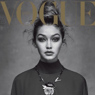
In an article for The Guardian, Eva Wiseman argues for media literacy in the face of images of «unhealthy» bodies. As an example, she uses the case of a Saint Laurent campaign image that was banned in the UK after the Advertising Standards Agency upheld a complaint that the model, Kiki Willems (IMG NY/London/Paris/Milan), looked too thin.
Our highlights:
The interesting thing about the ASA’s statement is that it has been careful to avoid any judgment on the weight of the model, instead focusing on exactly what was unacceptable about the image itself. Too often, when boring on about the problem with the fashion industry and body image, the fact that a fashion image is created is forgotten and the model within the image is critiqued directly. If a model’s legs look terrifyingly thin, it’s likely that the stylist wants you to see them that way. It’s not just the clothes that are styled, it’s the body itself. Shadows. Angles. The way she leans. Out of a hundred shots of a girl in a room, some labels will choose the one that suggests something awful happened out by the car.
You can’t tell from a photo whether or not a person is healthy. You can try, but you’ll probably be wrong. And this is never more true than with a fashion image, which has been manipulated and massaged by people who know exactly what they’re doing, until it is almost art. Which is why attempts to police the weight of fashion models seem often to be passing the blame on to the women, when they should be concentrating their anger on the labels that endorse them.


